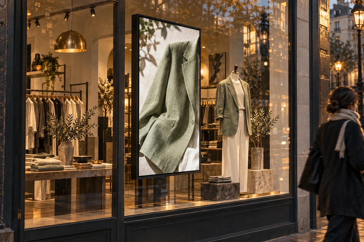
Retail digital signage works best when each screen supports a specific moment in the shopping journey: attracting attention, helping discovery, explaining a product or clarifying an offer. Match content to the location, keep it readable and verify that advertised products and prices are accurate. Begin with one useful display and test before expanding.
A shop window and a checkout queue are different environments, even when they use identical televisions. One reaches people who have not decided to enter; the other reaches people who are already buying. This guide helps retailers choose the right job for each screen and build a content process that remains manageable during ordinary trading.
Map the journey before placing screens
Walk through the store as a new customer. Notice what you can see from outside, where you hesitate after entering and where a little information would help. Look for actual questions rather than empty wall space. A screen should earn its position by making part of the visit clearer or more useful.
Write a purpose for each proposed location. A window display might introduce a new collection. A product-area screen might explain fit, materials or how an item is used. A checkout display might communicate collection information or a relevant service. These are separate briefs and usually deserve separate content.
Consider competing visual material. Shelves, packaging, posters and other screens already demand attention. Adding another bright rectangle can create noise unless its role is clear. Sometimes moving or simplifying an existing sign is more useful than installing an additional display. Design the store experience as a whole rather than treating each screen as an independent advertising opportunity.
Give the shop window a fast, recognisable message
People outside may see the display for only a moment, often through reflections. Use a strong product image and a short message that makes sense without waiting for a sequence. Show something relevant to the store rather than a generic brand film that could belong to almost any business.
Check the view from both walking directions and at different times of day. Sunlight, window treatments and surrounding lighting affect visibility. Confirm that the equipment suits the environment and installation. Do not assume a normal indoor screen will perform well in every window position.
Keep the advertised product or collection easy to find after entering. If the screen creates interest but the item is hidden at the back with no guidance, the experience becomes frustrating. Coordinate the display with merchandising so the visual promise outside matches the reality inside. The customer should not need to complete a treasure hunt to locate the jacket.
Use product-area screens to answer useful questions
Near a product, people may have more time and a clearer interest. Show information that helps them decide: how an item works, how it fits into a room, what a material looks like in use or which compatible accessory is relevant. Keep claims accurate and approved by the responsible team.
A short demonstration can be useful when movement explains something better than a photograph. Make it understandable without sound, and keep the key point visible for somebody joining halfway through. Avoid long introductions that spend the audience's attention before reaching the useful part.
Do not overload the display with every specification. Give enough information to support the immediate decision and provide an appropriate next step, such as asking a colleague or visiting a clearly identified product page. If a QR code is used, test it from the normal viewing position and ensure the destination is mobile-friendly and current.
Keep offers accurate across the store
Choose a single approved source for prices, dates and conditions. Check that the screen agrees with shelf labels, tills and other active promotions. A visually attractive offer becomes a service problem when staff must explain that the displayed price is no longer available.
Assign an owner to every campaign and include its end date. Plan how to remove content when stock runs out or a promotion changes. Unless a verified integration handles availability, somebody needs to update the signage deliberately. Do not mistake remote publishing for automatic stock awareness.
Use clear wording for the actual offer. Avoid presenting an attractive headline so prominently that necessary qualifying information becomes unreadable. Have the appropriate business owner approve promotional wording and conditions. This guide concerns presentation and workflow; specific advertising requirements should be handled through the retailer's normal review process.
Balance motion, brand and the physical environment
Choose a visual style that belongs in the store. A calm boutique may benefit from slow product footage and generous space. A busier setting may support more energetic material, but the message still needs to be understood. Brightness and movement should complement the environment rather than compete with every object in it.
Use consistent templates for common content types. Keep typography, spacing and logo treatment recognisable while allowing product images to change. Templates make routine updates easier and reduce the chance of a hurried promotion looking unrelated to the rest of the brand.
Consider staff who work beside the screen for hours. Repetitive sound, abrupt brightness changes or frantic animation can become tiring. Test a complete loop during a realistic working period and invite practical feedback. A display can attract customers without turning a sales assistant's shift into an endless film trailer.
Plan a content mix for each location
Create a short running order tied to the screen's purpose. A window loop might focus on a collection and a store-specific reason to visit. A product-area loop might alternate a demonstration with a clear product detail. A checkout loop might favour useful service information over a broad catalogue of unrelated items.
| Location | Useful content | Avoid |
|---|---|---|
| Window | Recognisable product and concise invitation | Long explanations and tiny conditions |
| Product area | Demonstration or decision-making detail | Claims unrelated to the nearby product |
| Checkout | Relevant services and collection information | Essential information hidden in a long loop |
Use the playlist guide to calculate loop length and message frequency. Keep each item understandable on its own because shoppers will rarely watch from the beginning. Remove content that does not serve the location, even if it was expensive to produce.
Connect central campaigns with local knowledge
For several stores, decide which content is shared and which information must remain local. Brand campaigns may be central, while opening hours, stock availability and local events can differ. Make those boundaries explicit so a national message does not accidentally advertise something one branch cannot provide.
Give store teams a simple way to flag a problem. They may notice a sold-out product, a reflection that obscures the message or a repeated customer misunderstanding before anyone at head office does. Define who can approve a correction and how quickly it should be checked.
Keep screen names and groups clear. A naming pattern based on branch and location helps prevent accidental assignment. The multi-location guide explains ownership, rollout batches and verification in more detail. Central control is useful only when it remains connected to what is happening in each shop.
Run a useful pilot and measure carefully
Choose one location and one question for the pilot. You might ask whether customers notice a new collection, whether a demonstration reduces repeated questions or whether collection instructions are easier to find. Record the situation before changing the display so you have a meaningful comparison.
Observe comparable periods and note other influences such as promotions, weather, staffing and stock. A sales change alone does not prove the display caused it. Combine practical observations with available business data and be honest about what the evidence can show.
- Define the audience and intended action.
- Check placement, lighting and equipment suitability.
- Create a short, approved content loop.
- Verify prices, dates and product availability.
- Publish and inspect the physical screen.
- Observe a comparable trading period.
- Change one element and review the result.
Keep the previous approved version available so a poor experiment can be reversed quickly. The aim is steady improvement, not permanent attachment to the first creative idea.
Build maintenance into normal store routines
Add a quick screen check to opening duties. Confirm that the right content is visible, the display is readable and no expired promotion remains. After a new campaign goes live, ask someone at the branch to inspect a full loop and report any incorrect cropping or unexpected gaps.
Maintain a small register of screen locations, player models and support contacts. Record recurring faults so they can be investigated rather than repeatedly restarted without explanation. Keep approved content files organised by campaign and orientation, and archive old versions outside the active playlist.
Review whether each display still has a useful job as the store layout changes. A screen that once supported a collection may become irrelevant after merchandising moves. Revisit the original brief and update placement or content accordingly. Use the design guide when readability or hierarchy needs attention.
Frequently asked questions
Where should a small retailer put its first screen?
Choose the location with the clearest useful purpose and a realistic viewing opportunity. That might be a window, product area or checkout, depending on the store. Inspect lighting and customer movement first. Starting where the message can solve a specific problem is more useful than choosing the largest empty wall.
Does digital signage increase sales?
It can support product discovery and clearer communication, but results depend on content, placement, stock and many other factors. Test a specific use case and measure comparable periods. Avoid assuming that any sales increase was caused solely by the screen.
Should all stores show identical content?
Shared brand material can save work, but local hours, availability and audience needs may differ. Define which parts are central and which require local approval. Verify the actual content at each branch rather than relying only on a group assignment in the dashboard.
How often should retail content change?
Change it when the information, offer or audience need changes, and review it regularly for accuracy. Constant novelty is less valuable than a clear, current message. Remove expired campaigns promptly and keep evergreen fallback content ready for gaps between promotions.