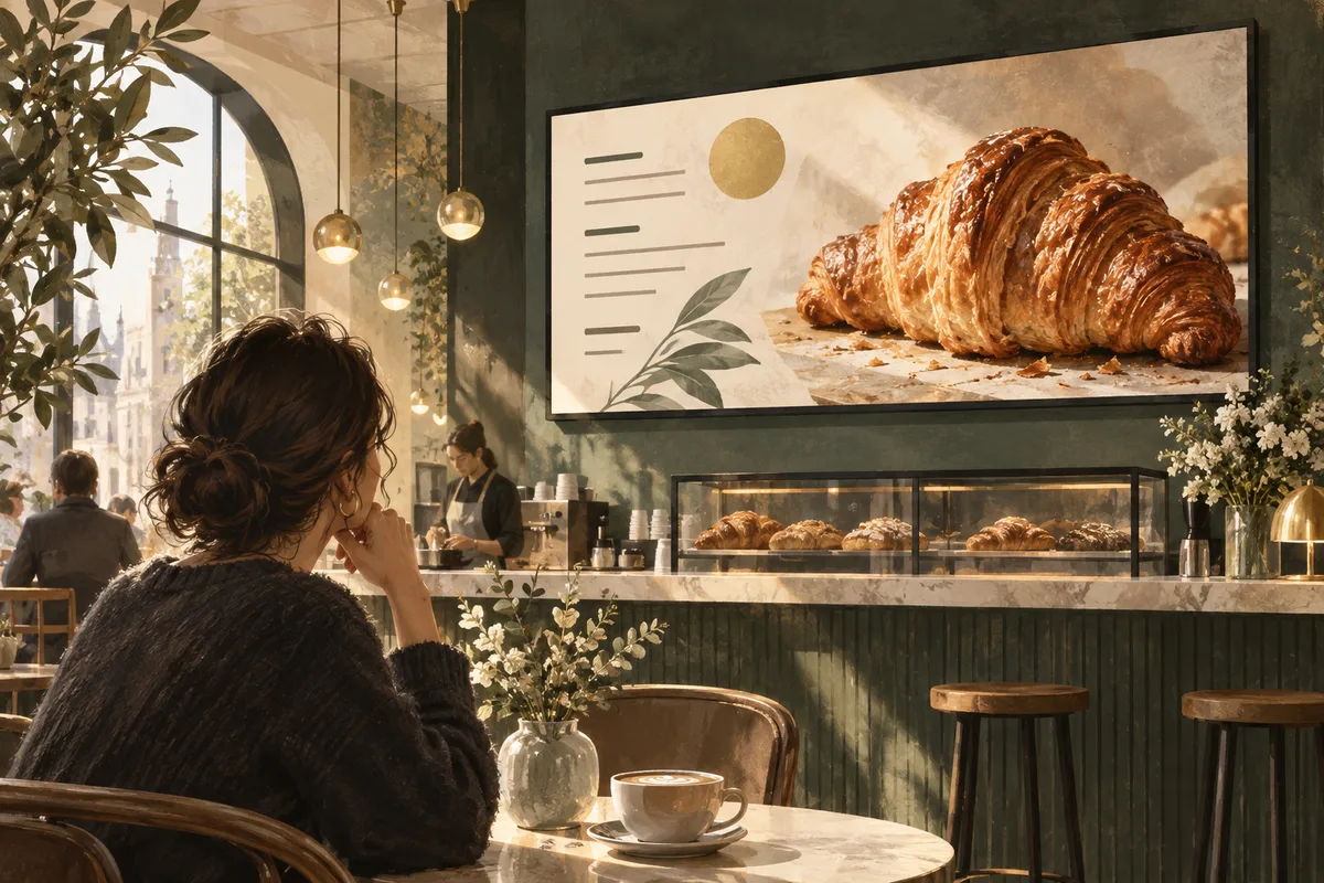
Good digital signage design uses one clear message, strong contrast, readable type and a layout matched to the screen and viewing distance. Build for a glance rather than a close read. Test the design on the actual display before treating a desktop preview as finished.
A beautiful screen can still fail if people cannot understand it while walking past. Digital signage has a different rhythm from a website or brochure: viewers arrive halfway through, stand at different distances and rarely wait for a complicated story to finish. This guide turns those constraints into a practical design process for menus, retail promotions, reception information and other everyday displays.
Design for the moment, not just the dimensions
Start by observing the audience. Someone passing a shop window may have only a brief opportunity to notice your message. Someone waiting in a reception area may have longer, but may be distracted by conversation or a phone. Someone ordering needs information quickly and should not have to wait for a menu to return.
Write down the normal viewing position and what the viewer is trying to do. That determines how much information belongs on the screen. A short product headline can work in a window; a list of appointment instructions belongs somewhere people have time to read it. Do not use the same composition everywhere simply because the export dimensions match.
Sketch the message in plain text before opening a design tool. Identify the headline, the supporting detail and the action. If the headline needs a paragraph of explanation, the brief probably needs editing. The display should help people make a decision, not offer an unexpected reading assignment beside the coffee machine.
Build a clear visual hierarchy
Give the most important element the strongest visual emphasis. This might be a product photograph, a destination name or a price, depending on the screen's job. Use size, position and contrast deliberately. When every element is large and bright, nothing is truly prominent.
A useful starting structure is one headline, one supporting image and one short action or detail. Add other elements only if they are necessary to understand the message. Your logo can establish ownership without occupying the same visual weight as the information people came to find.
Group related items together and leave visible space between groups. A product name and its price should feel connected. A direction and its arrow should not be separated by decorative material. Alignment helps viewers scan quickly: consistent edges and spacing make a layout easier to understand even when the individual elements are simple.
- Primary: the point somebody should remember.
- Secondary: the detail needed to understand or choose.
- Supporting: brand, context or a realistic next step.
- Remove: information that belongs on another slide or channel.
Choose type that survives the real room
Use clear fonts with distinguishable characters and sufficient weight. Thin decorative lettering can disappear against reflections or textured photographs. Keep font families limited so the design feels coherent. Use consistent styles for the same roles across your content library: headlines, prices, descriptions and small supporting details.
There is no single pixel size that guarantees readability in every installation. Screen size, resolution, distance, viewing angle and the font itself all affect the result. Export a test, display it at the intended size and read it from the farthest ordinary viewing position. If you need to walk closer to understand an essential detail, enlarge or simplify it.
Avoid using long blocks of capitals or tightly packed lines. Give text breathing room and keep sentences short. Check symbols and numbers carefully, particularly prices, dates and room names. A stylish typeface is not worth confusion between similar characters. Ask someone unfamiliar with the design to read the important information aloud from the audience position.
Use colour and contrast with purpose
Choose a small palette that fits the brand and preserves readable contrast. Light text on a dark solid background or dark text on a light solid background can be effective, but the actual colours matter. Test text over the busiest part of an image, not just a convenient empty corner.
Do not rely on colour alone to communicate meaning. A red item and a green item may need labels, shapes or clear wording so their difference remains understandable. This is especially useful for status information and directions. The aim is to make the message work for more viewers without requiring them to decode your colour system.
Check the screen at different times of day. A design that looks crisp in a dark studio may struggle with daylight reflections. Increasing saturation will not fix every visibility problem; you may need a simpler background, stronger type or a better screen position. Use the actual environment as the final judge rather than a laptop set to maximum brightness.
Make imagery specific and believable
Choose an image that supports the message directly. A menu promotion benefits from a clear view of the actual dish or a representative image that does not mislead. A retail slide should make the relevant product easy to recognise. Decorative stock photography can look polished while telling the audience almost nothing useful.
Crop with the final screen orientation in mind. A landscape photograph may lose its subject in a narrow portrait design. Prepare separate compositions when necessary rather than squeezing one file into every space. Keep faces, products and important details away from edges that may be affected by display settings or mounting.
Check image permissions and keep the approved source file. Avoid enlarging a tiny image until it becomes visibly soft. Equally, do not upload enormous files merely because they exist; export at suitable dimensions and quality for the supported player. Keep the original high-quality artwork so future formats can be produced without repeatedly compressing the same file.
Use motion to clarify, not compete
Motion can show a process, reveal a product or attract attention, but it should support the message. A slow transition between clear compositions is often easier to follow than several moving elements at once. Keep important text stable long enough to read and avoid making the entire message depend on catching the opening second.
Assume the display may be silent. Make essential information visible, and include captions where speech carries meaning. Avoid rapid flashing or aggressive movement. Consider the comfort of people who spend long periods near the screen, including employees who see the same loop many times during a shift.
Watch the full transition on the actual player. Check that it does not create a black gap, cut off the final words or reveal an unintended frame. If animation adds complexity without improving comprehension, use a still image. The content does not need to audition for an action film to explain where the lifts are.
Keep calls to action realistic
Choose an action that fits the location. “Ask at the counter” can work beside a staffed counter. A clear direction can help someone find a department. A QR code may be useful when viewers have time and a safe place to stop, but it should not be the only way to understand essential information.
If you use a QR code, test it from a realistic distance on multiple phones. Give it enough clear space and keep the destination understandable. Make sure the linked page works well on mobile and matches the promise on the screen. A beautiful display that sends people to an unrelated or broken page wastes the attention it earned.
Do not crowd a short slide with several competing actions. Decide which step matters most and make it easy. Use the playlist guide if supporting messages need their own space rather than being squeezed into one composition.
Run a repeatable design review
- Check the message against the original audience brief.
- Read every word, price and date against an approved source.
- Inspect the export at the correct aspect ratio.
- Test readability from the real viewing position.
- Observe the whole slide duration and transition.
- Ask an unfamiliar colleague what they understood.
- Verify links or QR destinations where used.
- Save the approved version with its review date and owner.
Use specific feedback. “The price is difficult to read from the queue” gives the designer something to fix. “Make it pop” mostly gives everyone something to sigh about. Separate factual corrections from style preferences and prioritise the changes that improve comprehension.
Create a small template library after the first designs pass review. Templates should define spacing, type hierarchy and safe content areas while allowing appropriate images and messages to change. Include a good example and a short list of common mistakes. This reduces accidental clutter when a colleague needs to publish a quick update.
Frequently asked questions
How much text should a slide contain?
As little as the message needs. The right amount depends on viewing time and the task. Begin with a short headline and essential detail, then test comprehension on location. A menu or timetable may require more information than a passing promotion, but still needs clear grouping and readable type.
Should every slide include the logo?
Consistent branding can help, but the logo should not compete with essential information. Use a suitable size and position within your template. In some locations the surrounding environment already makes the brand obvious, so clarity of the message deserves more space.
Is video better than a static image?
Neither format is automatically better. Video can demonstrate movement or a process; a still image can communicate a simple offer immediately. Choose the format that helps the viewer, and check playback performance. A clear photograph often outperforms an unnecessarily complicated animation for a straightforward message.
How do I design for several screen shapes?
Create separate portrait and landscape versions where the composition requires it. Reposition text and imagery rather than stretching the finished artwork. Preview each version on its target screen, and keep naming conventions clear so the correct file is assigned to the correct display.